
On Originality in Design
Essay for Monday 7 July 2014
Location – Home – Essays – 7 July 2014There is no such thing as a truly original idea. It is human nature – replete with its foibles and vulnerabilities – that leads us to think that there are truly original ideas. And that’s what make us hypocrites.
I wrote this essay to examine this trait, and to illustrate one of civilization’s strengths: how we advance by drawing on a collective pool of intelligence and experience. Even when we may not know it, or refuse to acknowledge it.
In particular, we’ll be taking a look at the current design format that Adobe uses for its application icons, otherwise known as the ‘Mnemonic’ system. The Mnemonic system bears a striking resemblance to a set of icons called the ‘Elemental’ system that I designed a decade earlier in the 1990s, which was in turn inspired by the works of others.
In writing to a colleague at Adobe about the issue in early 2007, I stated that ‘I would not be surprised to learn of an indirect historical link between the two designs’. Seven years later, I’ve decided to revisit the question on the off-chance that my historical perspective on the topic can be reconciled with the perspectives of those involved in the creation of the Adobe Mnemonic design standard.
To better understand why I designed the Elemental system in the first place, we’ll need to take a trip back to Pasadena in 1995. Pasadena has two well-respected universities: the Art Centre College of Design, and the California Institute of Technology. Although this essay is about design, we’ll not be visiting the Art Centre. We’ll be going to Caltech instead.
It is a mistake to assume that the arts and the sciences are diametric opposites. They may concentrate on fundamentally different subjects, but they share a lot in common. Both artists and scientists have to be curious, imaginative, creative, inventive, experimental, intensely focussed, ready to learn by trial-and-error, and perhaps most importantly – unafraid of repeated failure.
But first, let’s start with Isaac Newton.
Newton: the Human Being
Most people are familiar with Isaac Newton’s invaluable contributions to the sciences. However, few people have much understanding of Newton as a human being. Like the rest of us, he was a hypocrite.
Despite appearances to the contrary, science is a highly competitive discipline. The currency of the profession is your academic reputation: compromise it, and you stand little chance of recovering from the consequences. Newton knew how to play this game with great accomplishment, simultaneously establishing his own brilliant reputation whilst destroying the reputations of those who stood in his way.
Two examples of Newton’s handiwork are what happened to Robert Hooke and Gottfried Wilhelm Leibniz. Hooke was victim to Newton’s ability to rewrite scientific history after the fact. Leibniz saw his academic reputation destroyed by Newton due to a dispute over the development of the Calculus.
Let’s start with Robert Hooke. Both he and Newton were involved with the Royal Society, starting around the time of its founding in 1660. Hooke was appointed as the Curator by Office in 1665, and was responsible for experimental demonstrations at society meetings. Hooke died in 1703 – the same year that Newton was named President of the Royal Society.
Over the next twenty-four years up to his death in 1727, Newton appears to have been behind a scheme to obscure Hooke’s scientific contributions from the history books. The fact that no contemporary portrait of Hooke exists today is a tribute of this achievement. Historians and biographers have heaped praise and attention on Newton over the past three centuries; Hooke remains a relatively unknown figure.
The dispute between the two men apparently centred around a number of subjects, including gravitation, optics and astronomy. In a letter to Hooke discussing optics dated 5 February 1676, Newton wrote the following:
‘What Des-Cartes did was a good step. You have added much several ways, & especially in taking ye colours of thin plates into philosophical consideration. If I have seen further it is by standing on ye sholders of Giants.’
‘Standing on the shoulders of giants’ is one of Newton’s most famous quotes. It acknowledges that no idea can stand in isolation from the ideas of others – we progress by building on one another’s work. Since Newton and Hooke were already in dispute by 1676, it isn’t known if Newton genuinely meant what he wrote – or if he was simply taking a swipe at Hooke. Either way, Newton’s attempts to obscure Hooke’s contributions to science after 1703 lay in stark contrast to his 1676 correspondence, and leave the impression of hypocrisy.
Let’s consider the Calculus next. According to Newton, he started working on this important field of mathematics as early as 1666. The first parts of his methods were published in the Principia in 1687, followed up by a more detailed explanation in 1693. However, it wasn’t until 1704 that a complete version of Newton’s Calculus appeared in print.
Gottfried Wilhelm Leibniz was a brilliant polymath who spent most of adult life living and working in Hanover. He started his work on Calculus around 1674, and published his first paper using the mathematical methods in 1684. Leibniz’ particular form of differential notation is the one largely favoured by mathematicians today.
Many contemporary historians theorize that Leibniz and Newton independently developed the Calculus. However, this wasn’t what Newton felt at the time. The issue simmered for a while between 1696 and 1704, but broke out into open dispute a few years after that.
In an attempt to settle the matter, it was proposed that a special committee of the Royal Society weigh the evidence and write a report. Leibniz was never called to give evidence, and it appears that the President of the Royal Society (a.k.a. Isaac Newton) wrote large portions of the report himself. The result was published in 1713, and unsurprisingly vindicated Newton. Leibniz’ death in 1716 gave Newton the convenient advantage of slandering him for another eleven years until his own death in 1727. By the time he was complete, Leibniz’ reputation was in shambles, and was further damaged by Voltaire’s satire ‘Candide’ in 1759.
It is impossible today to ignore the intellectual contributions of Newton. A brilliant man in his own time, his influence over modern civilization is immense. However, he wasn’t a man to cross – and his twenty-four year reign over the Royal Society gave him the power and the means to enhance his own reputation whilst destroying anyone whom he thought got in his way.
In essence, Newton typifies what it is to be human. He claimed to stand on the shoulders of giants, but seemed equally willing to cut down anyone else who tried likewise. He even went as far as to cut down the giants from underneath him when it suited his own purposes. And it is with this in mind that we return to the present.
1995: The California Institute of Technology
My undergraduate years were spent at Caltech from 1995 to 1999. The institute was a fascinating place, filled with brilliant minds and experiments. And as in most situations, one was prone to learn far more outside the formal bounds of education than within.
Caltech has a reputation for being an place for eccentric minds to live in relative obscurity and discretely do their work. Unfortunately, the appearance of a certain sitcom on television has made the institute more widely known. My family watch the show as if it was a documentary, and I have to keep on reminding them that Caltech isn’t like what they see on television. It’s much stranger than that.
The undergraduate life at Caltech is never boring. Most students live on campus in residences called ‘Hovses’. Yes, that’s ‘House’ with a ‘v’: the result of the way the word is carved in Roman capitals above the front doors of the four original residences. The Hovse System is a unique compromise between dormitories and fraternities – every student is a member of a Hovse, and each Hovse has a prevailing character and set of traditions that slowly change with time.
The first four Hovses (now known as the South Complex) were opened in 1931. A North Complex containing three Houses (yes, that’s ‘House’ with a ‘u’) were added in 1960. I helped found an eighth Hovse in 1996, which was a combined residence for undergraduates, graduates and faculty members.
All freshmen spend their first couple of weeks going through something called Rotation, where they visit each Hovse in turn. Then after a proprietary process which both freshmen and existing Hovse members participate in, each freshman is assigned to a mutually-selected Hovse. When I arrived on campus in 1995, I did Rotation through the seven existing Hovses. In the end, I became a member of Ruddock House. I had ranked Ruddock in seventh place out of four: that should give an idea of how popular – and mathematically astute – I was at the time.
The Periodic Table Block
After spending a while trying to ingratiate myself at my first choice of Hovse – and having completely failed to acquire membership there – I resigned myself to the fact that I’d be stuck in Ruddock House for the foreseeable future. Unfortunately, a few senior Ruddock residents had decided they didn’t like me, and went to special efforts to make me feel unwelcome. Unwanted by my first choice of Hovse and actively disliked by a faction in Ruddock House, I was a popular figure.
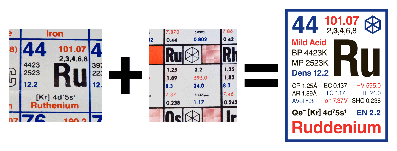
To try to make amends, I went to special efforts to ingratiate myself to other residents. This included restoring the House library and organizing social events. One project was the design of a new official Ruddock House T-shirt. The design had to witty, and something that members of the house would voluntarily wear. I turned to the Periodic Table of Elements for inspiration.
Of all the elements in the Periodic Table, only two were reasonable matches for specific Hovses. Radioactive element 91 Protactinium (Pa) matched Page House appropriately. But element 44 Ruthenium (Ru) matched Ruddock House beautifully. Members of Ruddock House are called Rudds – changing ‘Ruthenium’ to ‘Ruddenium’ was a natural and obvious choice. So using my trusty Periodic Table poster (courtesy of the African Explosives & Chemical Industries) as a reference, I made the following design:
I built the design on an abandoned NeXTcube in the corner of a computer lab. I printed and posted a dozen colour copies around Ruddock House for review. An few hours later, a senior resident ripped down every copy, making it abundantly clear that they didn’t like my idea. This was a pity, because nobody else got to see the design.
And so ended my attempt to ingratiate myself at Ruddock House.
The Caltech Complex Map
During the first couple of months at Caltech, I observed an interesting behaviour playing out in the undergraduate Hovses. After the initial flurry of Rotation at the beginning of the academic year, freshmen would settle down in their respective Hovses. Most new residents would then adopt the traditions and personalities of their Hovse, and then rarely emerge from them over the next four years.
In retrospect, it seems natural for a bunch of socially awkward teenagers – almost all of whom have never lived away from home – to want to fit in to their new surroundings. But the degree to which it occurred surprised me. I estimate that fewer than ten percent of all freshmen would circulate around the other Hovses; the remaining ninety-plus percent remained ensconced in their own Hovse, once settled in.
It takes about two minutes to walk from one end of the seven Hovses to the other. The three Houses in North Complex are easily navigable. However, the older South Complex is a maze of corridors and dead ends – its four component Hovses each have unique floorplans. In 1995, the smallest Hovse was Dabney with sixty-two residents; the largest was Ruddock with ninety-six.
One would imagine under those circumstances that students would take a few minutes to explore the immediate area surrounding them, but this was rarely the case. Instead, students were more familiar with large system of underground tunnels linking buildings across entire university campus. A friend even mapped the entire system within a week of arriving on campus, annotated with a list of the keys needed to gain access to each building. It was evident that students knew more about lay below ground that what lay above.
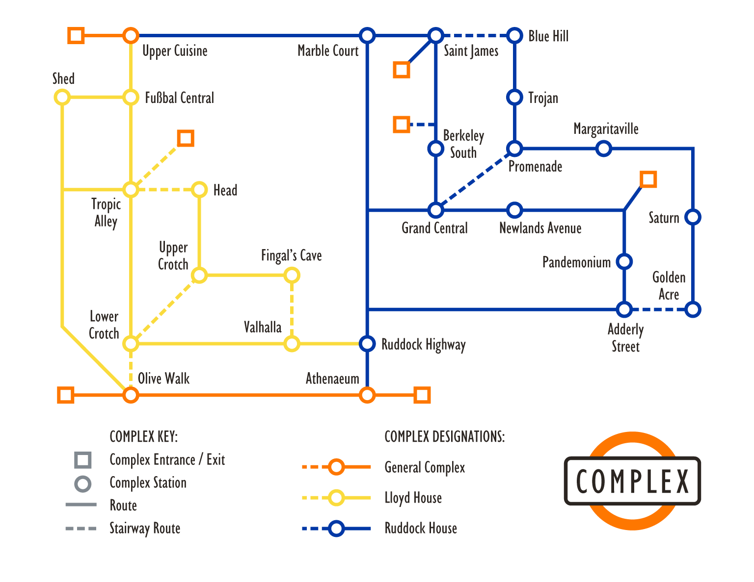
Since I saw no need for yet another map of the Caltech Tunnels, I decided to concentrate on something more practical: a comprehensive map of the undergraduate residences. Every hallway in every Hovse had a name. Some of them were mundane, like Alley Five. Others were formal, like Vatican and Valhalla. Some were whimsical, like Elephant and Snake. Others were bizarre, like Pandemonium, Weight and Prexy.
At the time, I lived near Grand Central in Ruddock House – a lounge used as a general meeting place for residents. The name sounded like a railway station, and that gave me an idea. Perhaps undergraduates would be encouraged to explore beyond their immediate environs if given the means to do so. And the means would be in the form of a special map, like those used by public transport systems.
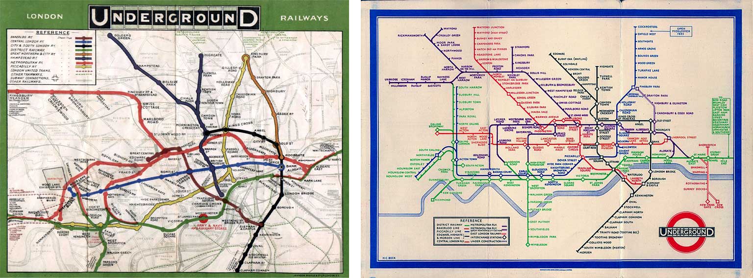
The obvious model to use was the famous London Underground map. Originally designed in 1931 by a draftsman named Harry Beck, the Underground map was drawn in the same way as an electrical diagram. Rather than show the absolute geographical locations of stations, the map uses an relative system of layout, where the connections between each station are the most important element of the design.
Given that Caltech’s speciality is science and engineering, an abstract map of the undergraduate Hovses was ideal for the purpose. That, and the difficulty of drawing a geographically-accurate map of multi-story buildings in anything other than three dimensions. Choosing a name was fairly straightforward too – ‘Complex’ was appropriate, given that undergraduates already called the two sets of Hovses the ‘South Complex’ and ‘North Complex’ respectively.
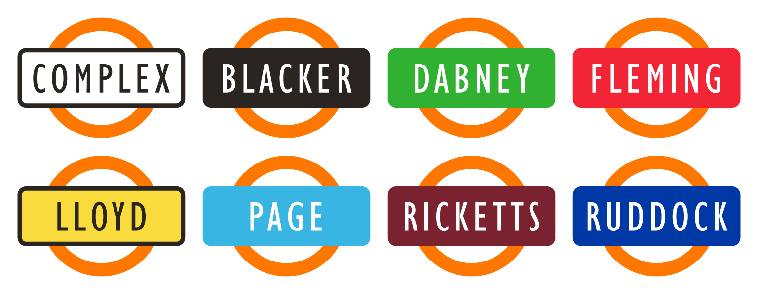
Building a Complex map was a simple proposition. Since every Hovse was divided into alleys – and every alley had a name – each alley could become the equivalent of an Underground station, and the Complex map would show how alleys were linked to one another. Each Hovse had an official colour: these colours could be used as a way to indicate which Hovse the alleys and their connections were located in.
To make the Complex system a reality, one further step was required. I had to design a set of signs – one for each alley – that could be prominently placed throughout the Hovses so that students using the Complex map would know where they were. Since the map was going to reflect that of the London Underground, why not look to the Underground’s signs for inspiration as well?

The London Underground sign is one of the first and best examples of graphic design. The red ring represents the circular tunnels cut underneath London that give the system its nickname: the ‘Tube’. The blue bar is used to show the name of system, or the name of the station where you are located. Caltech’s official colour is orange, so I built a standard sign design to reflect this.
However, I did make one significant addition. Since the seven Hovses were so physically intertwined, it was difficult to know where one began and the other ended. So the signs needed to have an extra clue to let students know where they were: I colour-coded each sign using the official colours of each Hovse.
After the design templates had been finished, it was time to start mapping out the Complex system. I began with Ruddock House, mapping the building out from Grand Central. Since Ruddock’s official colour was blue, the entire map was the same colour – and rather uninteresting as a result. Having spent my first two weeks at Caltech in residence at the neighbouring Lloyd House, I expanded the map westwards to add a second colour.
But there is a difference between having an idea and putting it into action. So I spoke to the Presidents of Ruddock and Lloyd to get their permission to place temporary Complex signs and maps around the two buildings. Having done so, I printed colour signs and maps, and posted them about. The map below is an original copy dated 12 November 1995 that I rediscovered on an old floppy disk in my archive:
Responses to my Complex system covering Lloyd and Ruddock Houses were mixed, but reasonably positive. Residents of Lloyd liked the idea overall. Feelings in Ruddock were generally ambivalent. However, the entire scheme was placed into question when a few senior residents ripped down everything around Ruddock House at 3 o’clock on a Sunday morning.
At that point, I decided that if the signs were unlikely to remain standing in my own residence, how would residents of the remaining five Hovses respond to a stranger posting signs around their buildings? And so I abandoned the idea of a complete Complex system, but still look back on the experiment with a certain fondness. The last remaining signs in Lloyd House survived for several months more before being retired from service.
The Science of Design
Before we continue, let’s consider some basic principles of design. I am a proponent of functional design: where form follows function. Functional design prizes simple solutions, but not simplistic ones.
A practical method to approach functional design is to use a two-step process. First design something exactly the way you want. Then remove absolutely everything from the design that isn’t absolutely necessary. The final result is the design as it should have been from the beginning.
The first step in this process is quite easy. The second step is rather difficult, and is where you’ll spend most of your time achieving apparently very little. But the results of functional design can be found in some of civilization’s most admired products and services. An old example of functional design is the London Underground map; a contemporary example is Apple’s line of simple, yet sophisticated products.
Design can be rationalized like any other discipline. For example, let’s assume that you need to make seven objects distinct from one another. Here are a few potential solutions:
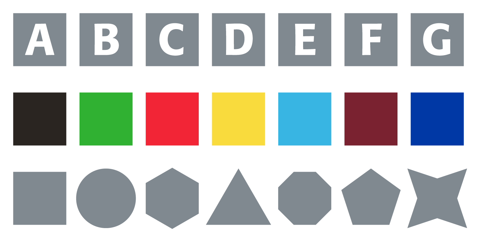
In the first case, each object has a different label. In the second case, each has a different colour. And in the third case, each object has a different shape. All three solutions are one-variable designs: that is, only a single property changes from one object to another in each case. This is an excellent example of functional design.
Let’s assume that you choose the second of the above options (different colours) as the basis for designing a line of products. Over time these products become popular, but some of your customers find it difficult to distinguish one product from another. This is due to the fact that about one in ten people have some form of colour blindness.
In this circumstance, you have a couple of choices. One option is choose another one-variable design for your objects. If this is not a practical possibility – i.e. most of your customers have become used to the original colourful designs – then it may be necessary to add a second design variable:
The first example above differs in both colour and label; the second differs in colour and shape. Functional design would only call for a two-variable solution if a one-variable solution was inadequate for the purpose.
In the case of my Complex sign system, a two-variable design was appropriate. Every sign was identical, except on two counts. First, the sign would change colour to indicate which Hovse you were in. Second, the label would change according to the alley you were in. This was necessary, because there were a few cases where alleys in different Hovses shared the same name.

The reason why functional design advocates for the simplest possible solution can be illustrated by increasing complexity. The more variables you add to any design, the less impact each variable has – and the more likely people will become confused.

The three-variable design illustrated above is an example of unnecessarily complex work. There is no practical need to change the label, colour and shape of an object when changing just one would be sufficient for most purposes. Changing two might be appropriate in some cases, but three doesn’t make much sense unless it’s absolutely necessary. If your deliberate intent is to make an overly-complex design, then that’s another matter.
Unfortunately, functional design is difficult to achieve in practice. The text on this webpage may be unnecessarily complex: sectional headings are capitalized, copper in colour, and sized larger than the body text. That’s three variables, if you ignore the grey rules that appear above most headings. But not always using functional design isn’t an excuse for ignoring its advantages.
Building a Digital Workflow
In 1996, I was appointed editor of Caltech publications. Not that it was any achievement: anyone who was gullible enough to volunteer got the position. I was given responsibility of the annual publication with a co-editor, who displayed great talent by being absent on the job. After an initial meeting, we divided up the publication into sections and I started work on the ones assigned to me.
I quickly discovered that the publication’s existing workflow was too cumbersome. It used proprietary software for word processing and rudimentary page layout geometry, and all photographs and illustrations had to be submitted separately for scanning and correction. Our publisher – who was located two thousand kilometres east of Pasadena – would then take care of most of the production and printing. The workflow involved repeated cycles of posting materials for review and approval between California and Texas. It was time-consuming, inefficient, expensive, and lacked the flexibility that we needed.
The 1993 introduction of Adobe’s PDF file format provided us with a practical solution. Based upon the PostScript language universally used throughout the printing industry, PDF allowed us to supply our printer with finished layouts that were press-ready. Taking advantage of a PDF workflow meant that we could gain full control over the creative and production process, using a combination of PageMaker, Live Picture, Illustrator, Photoshop and a set of supplementary applications.
Unfortunately, our printer wasn’t quite ready to support our new fully digital workflow – and so they flew me out to Texas to confer with their production staff. The end result was a workflow in which we delivered finished layouts in PDF format alongside all of our working files (should anything need to be changed at the last second). I remember them commenting that this was the first time that they’d seen anything like it, and I was excited by the possibilities that it afforded.
Naturally, everything works beautifully in theory, but never in practice. The next year was filled with a lot of experimentation, trial-and-error (mainly error), and much problem-solving. After a lot of bootstrapping, we settled on an approach that best worked for us.
There were a few achievements that I was proud of. First, that of digital photography. Although we took most of our pictures on film and scanned the negatives, there were a few cases where contributors started experimenting with digital cameras. At the time, a 1024 × 768 pixel digital photograph was considered an abject luxury, but it was good enough to produce an acceptable 6" × 4.5" print. And so we did it.
Second, there was the issue of acceptable typography. A new PostScript-based font technology called Multiple Master was available, and my colleague Robert Slimbach had designed a few typefaces (Minion, Myriad and Adobe Jenson) that could take advantage of its features. Multiple Master fonts could be adjusted on the fly – they had controls that allowed users to change properties like weight, width, optical size and style on a continuous scale. We licensed Robert’s Jenson design and used it extensively through the publication. Jenson had two Multiple Master scales: one for weight and another for optical size. We used the weight scale to compensate for the physical printing differences that occur when setting black text on white backgrounds, and white on black.
Third, a major challenge at the time was the matter of computer performance. Photoshop was adequate for editing individual photographs, but no good at composing an entire spread of pictures. And so we relied on a hybrid system using both Photoshop and the now-defunct Live Picture. Photoshop was used in the image acquisition and editing process, and Live Picture allowed us to produce complex layouts quickly. We hacked together a custom multi-processor Macintosh with 272 megabytes of RAM (unheard of at the time) to handle our production work.
Looking back at what we achieved, I am still surprised by how much we managed to do with the lack of resources and staff at hand. However, every project has its issues. Our biggest challenge was my permanently-absent co-editor, whose talent for invisibility led us to delay our final press run. I am thus deeply indebted to Wren and others, whose contributions were invaluable in completing the publication.
The Elemental Icon System
I quickly noticed a significant issue with our new production workflow: files got easily mislaid. This is not particularly surprising to anyone who has to simultaneously manage a few thousand files. Content management systems weren’t a practical possibility in the late 1990s – one had to do with the operating system’s own file system instead. In our case that was Apple’s System 7.5, which used HFS for handling file structures.
One practical solution would have been to keep a database file or spreadsheet detailing where files were located. But that would have required updating the database every time a new file was created or an existing one was moved. So a simpler solution was called for.
The Macintosh operating system has some fascinating features. Before the introduction of Mac OS X, Systems 1.0 through 9.2.2 broke a single file into two pieces: a data fork and a resource fork. The data fork contained the working data of the file; the resource fork stored everything else, including graphical user interface details and metadata. For example, an application file’s data fork contained the functionality, whilst its resource fork included everything from the application icon to the user interface, menus and dialogue boxes.
Because of HFS’ ability to support customization, the most obvious solution to our file management issue was to create a set of custom graphical icons that could be added to the resource forks of every folder in our workflow. The icons had to be easy to identify and simple to make, since we needed quite a number of them.
Our publication allocated a section to each of the seven existing undergraduate Hovses for their own use – these were one of my responsibilities. Since each Hovse had several hundred files to manage, I decided to start by designing custom folder icons for the purpose. The challenge was how to do so in a space no larger than 32 × 32 pixels, the standard size of a Macintosh graphical icon at the time.
My engineering instincts immediately took over: I had a total of 1024 pixels to play with, so I had to use them wisely. Designing something that looked like a folder would waste pixels; it was better to use all 1024 pixels instead. And whatever appeared within the 32 × 32 pixel square had to be immediately recognizable to those working on the publication.
Since Caltech was an institute dedicated to science and engineering, it made sense to use familiar symbology. So I chose to revisit the Periodic Table of Elements, using two-letter abbreviations would easily fit within a 32 × 32 square. The choice of an appropriate typeface was important: it would need to have simple, open letterforms. We’d recently licensed Bernd Möllenstädt’s excellent 1984 Formata design from Berthold, who celebrated their 140th anniversary in 1998 by going bankrupt. Here is the first iteration of the icon design:
There was something appealing about the simplicity of the icons. I named the design the ‘Elemental’ system, because of its relationship to the Periodic Table. This wasn’t the first time that I’d drawn inspiration from the Periodic Table – I used a similar scheme when I was teaching myself botanical taxonomy back in the 1980s. For example, genera within the family Proteaceae could be abbreviated as follows: Protea (P); Leucospermum (Ls); Leucadendron (Ld); Serruria (Se); Sorocephalus (So); Spatalla (Sp); et cetera.
It’s tempting to think that placing a couple of letters within a square is easy. But how you place them in the square is a question of design. What size should the letters be in proportion to the square, and precisely where in the square should they be positioned? In situations like these, I inevitably turn to the mathematician’s solution: use the Golden Ratio.
Otherwise called ‘phi’ and valued at about 1.618034:1, the Golden Ratio is found everywhere in nature. Perhaps the best example is the logarithmic spiral shape found in nautilus shells; the pattern of sunflower heads also follows the ratio. The architect Le Corbusier designed his Modulor system entirely using the Golden Ratio. Even the proportions of most widescreen computer monitors today closely mirror the Golden Ratio.
In the case of my Elemental icon design, the height of the letters in proportion to the square was calculated on the Golden Ratio. The letters were then centred within the square optically. In mathematical terms, this geometric diagram better illustrates what I mean:
But there was something missing from my first version of the Elemental icons. After testing them out for a few hours, the problem became obvious. Designing an icon at full-screen size is one thing; using the same icon at 32 × 32 pixel size is another. Because the icons were all grey, they were too similar – and it was then that I decided to make them more visually distinct.
At that stage, the Elemental icons were a one-variable design – the only thing that changed from icon to icon was the two-letter label. Rebuilding the icons as a two-variable design made sense – and the simplest choice for the second variable would be to use colour.
Two-variable design was something that I had done before when I built the experimental maps and signs for the Caltech Complex a year earlier in 1995. Since the folder icons that I was designing were initially meant for sorting publication files belonging to the different Hovse sections, it made sense to colour them accordingly. And so I combined my two previous designs into a new one that worked nicely:

The result was a flexible icon system that could be quickly updated and easily appended:
Over the next few years, the icons changed. However, the two-variable design principle remained the same. This set of icons dates from 1998, and was designed as part of an experiment to produce a bevelled effect using Photoshop:
And so the Elemental Icons came into regular use at Caltech publications. After a while, they started to migrate around campus: I used to occasionally discover them on systems in the Hovse computer labs. A characteristic of successful design is that other people find it useful. I was therefore happy to notice other students making use of my Elemental icons, oblivious of their origin.
Interlude to Snood
The undergraduate life at Caltech is a rather intense one, and has a reputation for being one of the most difficult educational experiences in the world. There’s an old saying on campus: ‘Academics; social life; sleep. Choose two.’ Many think that the saying should be changed to say ‘Choose one.’
On occasion, it is important to take a break from study. And for most students, that means doing something that involves as few neural circuits as possible. Enter the thought-free computer game.
In the late 1990s, the brainless game of choice on the Caltech campus was Snood. Designed by University of Michigan student Dave Dobson, it had basic rules, even more basic graphics, and only required you to slightly move a mouse and click away at your own pace. Snood was highly addictive, and caused many people grief. A friend – one of the most brilliant people that I’ve known – was even forced to go on a term’s sabbatical to recover from the side-effects of Snood.
Naturally, a Caltech version of the game had to be made. And so in 1998, an edited version of the game made its way onto Macintoshes around campus:
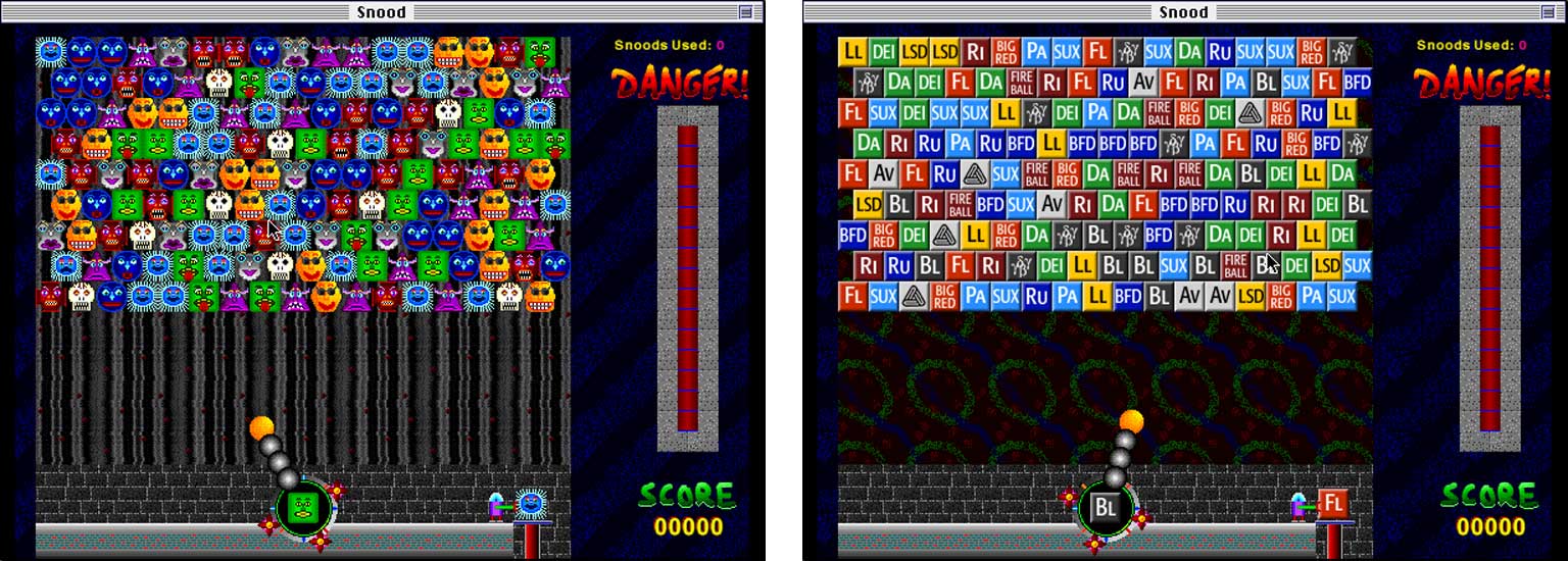
The reason why the game could be rebuilt on Macintosh was due to the same data/resource fork structure that allowed me to create my custom Elemental folder icons. Since the user interface of a Macintosh application was defined within its resource fork, all that I required was an editor like ResEdit to make cosmetic changes on the fly. Substituting in Elemental icons for the original Snood characters was almost as brainless as playing the game itself – so that’s precisely what I did:
The revised version of the game made its way slowly around campus, but was eventually put out of commission by the advent of Mac OS X. And if you’re curious to learn what the second row of elemental icons in the above graphic mean, I’m afraid you’ll have to ask a Caltech undergraduate. Some mysteries are best left unresolved.
The Adobe RIBS Installer Icon
But let us leave the halcyon days of my tortured youth, and cross over to the current millennium. Ever since helping found the InDesign User Group in New York back in 2001, I’ve had collaborative relationship with Adobe Systems and the people that work there. Adobe is an interesting company: it bridges the traditional rift between the sciences and the arts. I professionally do the same myself.
As with any technologically-minded company, Adobe does a lot of research and development. And this is the part of the story where we will need to tread lightly. Software development typically involves a degree of secrecy and non-disclosure, because companies don’t want the risk of their competitors getting any type of advantage over them. But in our particular case, there are five reasons why non-disclosure is a moot point.
First, the software in question was released to the public on 27 March 2007, and has since been replaced by five subsequent major releases. Second, seven years have elapsed. Third, the information that we’ll be examining discloses no significant functionality that wasn’t obvious in the final public release in 2007. Fourth, others have already described the development of the software in greater detail than I will. Finally, it should be noted that what I’ll be discussing is a critical development in this essay.
The software in question was Adobe’s Creative Suite 3. It was an important release for the company, since it represented the first time that both Adobe’s and Macromedia’s software were being integrated into a single product after the merger of the two companies in December 2005. Adobe Creative Suite 2 was released in April 2005; Macromedia Studio 8 followed in September of that year. Creative Suite 3 offered the combined company a fresh start.
Creative Suite 3 effectively combined Adobe’s print and video applications with Macromedia’s web tools. That meant After Effects, Dreamweaver, Flash, Fireworks, Illustrator, InDesign, Photoshop, Premiere and several other applications could be purchased together, and would be more compatible with one another.
Development on the individual applications had already started prior to the merger – it is normal for software to be under continual development. However, stitching the applications together into a single suite would take a bit more time. Adobe’s applications have always enjoyed a great degree of independence from one another, so it is better to think of the Creative Suite as a set of separate applications that happen to share similar user interfaces, common technologies and a variety of file formats.
So the key to making users think that the Creative Suite is a unified piece of software lay more in its superficial window dressing than in its underlying technological integration. This previous sentence should not be construed to underplay the important efforts of Adobe engineers; instead, it should be seen in the context of the end users, who for the most part are creative professionals who possess strongly-held views on design and aesthetics.
By late 2006, development on Creative Suite 3 had reached a point where things were looking stable. One part of the CS3 development programme was devoted to an application called RIBS. This piece of software was a universal installer for CS3 that reduced the complexity of adding and removing CS3 applications from one’s computer.
Before RIBS was introduced, installation of Adobe applications happened in serial. A user would have to install separate applications one after another – and Creative Suites 1 & 2 would do roughly likewise. RIBS simplified this process, by installing a set of technological components common across all the CS3 applications, and allowing users to install or uninstall separate CS3 applications in a more orderly manner. That didn’t mean that the process would work flawlessly – it meant that things would be a lot easier.
And so it was in late 2006 that I downloaded Build 352 of Creative Suite 3. I copied the installer disk image to the developer partition of my hard drive (never use alpha or beta software on your working partition), and double-clicked on the DMG file to open it up. After the image had been verified, this is what I saw:
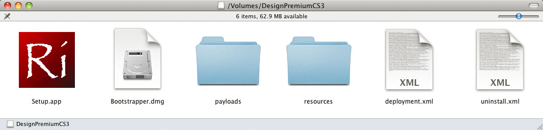
I looked at the screen. It looked back at me. So I looked again, and then laughed out loud. Staring me in the face was the RIBS application icon: a colourful maroon square with the two-letter symbol ‘Ri’ inside it. And the first thought that entered my mind was ‘There must be a Skurv behind this.’
It is necessary at this point to once again visit the Caltech campus and its eclectic undergraduate Hovse system. More specifically, one particular Hovse in the South Complex: Ricketts. Founded in 1931, Ricketts Hovse curated a reputation for eccentric behaviour. Part of this involved outlandish acts intended to shock people’s sensibilities, including extreme experiments with fire in the 1970s, 1980s and 1990s.
The residents of Ricketts Hovse were called ‘Skurves’. This nickname was a little play on ‘Ricketts’ – the disease caused by a deficiency in Vitamin D. In many ways, it was an appropriate name because Ricketts Hovse members spent most of their time staring at computer screens during the day, and confining most of their Hovse social activities to nighttime hours. The body manufactures most of the Vitamin D it requires from exposure to ultraviolet daylight; Skurves in general got proportionally less of it than residents of the other Hovses.
Part of what makes up the character of any undergraduate Hovse is its residents’ choice of academic major. Although you’ll find most majors present in every Hovse, each Hovse tends to have a concentration of one or more specific majors. In the late 1990s, Computer Science majors tended to gravitate towards two Hovses: Dabney and Ricketts.
Getting back to my computer screen and the Creative Suite 3 RIBS installer icon in late 2006, I was staring at a maroon square containing the letters ‘Ri’. The official colour of Ricketts Hovse was maroon. And Ricketts Hovse had been home to many Computer Science majors over the years.
From my frame of reference, the most obvious conclusion was that this was the work of a programmer from Caltech who most likely had been a member of Ricketts Hovse. At some stage, they may have encountered (or even used) the custom icons that I had designed in the late 1990s. And when a temporary icon was needed for the RIBS installer during the development of Adobe Creative Suite 3 around 2006, they built one based upon the design that I had created a decade earlier.
But on second consideration, that explanation seemed a little too convenient for my own purposes – perhaps the whole thing was a wild coincidence. So I decided to calculate the probability of randomly selecting a design that contained a maroon square and the letters ‘Ri’.
Let’s assume it’s a given that a two-variable design identical to my Elemental system has been selected out of many different design possibilities. The chances of that occurring in the first place are quite small. So let’s concentrate instead on the probability of selecting the two letter permutation ‘Ri’. There are twenty-six letters in the alphabet, which means that the chances of selecting ‘Ri’ are 1 in 676 (26 × 26). And that doesn’t take into account whether the letters are capitalized or not.
Next, let’s consider the choice of colour. Maroon (or burgundy for those of you who prefer to be picky) isn’t exactly the most obvious choice. The three primary colours, three secondary colours, black and white come more easily to mind. Even if you expanded the number of possible colours out to include the standard set of sixteen used by EGA video adapters in the 1980s and 1990s, maroon still isn’t one of them. But let’s be generous and assume that maroon is one potential colour choice out of a possible sixteen.
If the total number of potential two letter permutations is 676 and the choice of colours is limited to 16, then the chance of choosing a maroon square with the letters ‘Ri’ is 1 in 10 816 (676 × 16). And those are very small odds.
Another thing to take into account was the unusual choice of ‘Ri’, rather than ‘RI’. In my experience, the RIBS Installer’s name was always spelt using capital letters – so it didn’t make sense to have an icon that had a lowercase ‘i’. Using ‘Ri’ as an abbreviation for ‘Ricketts’ made more sense.
And so after due consideration, I thought that the chance of such a coincidence were simply too small, and that my original assumption carried a higher probability of being correct. After all, there’s always demand in Silicon Valley for computer scientists, and Caltech produces its fair share of majors. And the opportunity for a programmer from Ricketts Hovse to leave a small memento in the form of the RIBS application icon seemed to be typical of the character of an ex-Caltech undergraduate.
The Adobe Mnemonic Icon
In the few months leading up to the official release of Adobe Creative Suite 3 on 27 March 2007, new icons started appearing. During the development of a new version of a piece of software, the application usually retains the previous version’s icon until a new icon design is ready. As Creative Suite 2 icons started being replaced with Creative Suite 3 ones, I was surprised to see what I originally considered to be a once-off prank by a Ricketts Hovse programmer turn into a more rigorous design standard.
I even wrote to a colleague at Adobe in early 2007 pointing out the similarities between my own Elemental icons and the ones being used for Creative Suite 3. My correspondence included the following comparison of icons, demonstrating a precise match between Fleming House and Flash Pro:
The typeface used on the new CS3 icons looked familiar. My colleague Robert had been working on a new corporate typeface for Adobe, because the existing one (Myriad) was then in widespread use. Apple had switched to using Myriad for their own corporate identity a few years earlier, so Robert had been asked to make a new proprietary design for Adobe’s use. This typeface is now named ‘Clean’.
I asked Robert about the lettering on the Creative Suite 3 icons. He said that he’d been asked to make a special version of the Clean corporate typeface, and that this build was named ‘Mnemonic’. Since then, Adobe has referred to their icon system by the same name.
Like Bernd Möllenstädt’s Formata typeface, Robert Slimbach’s Adobe Clean and Mnemonic share the same open sans-serif letterforms. Each typeface has its particular characteristics – and if used with care, can be an effective and integral part of the simplest designs. In the case of my own Elemental system and Adobe’s Mnemonic system, Formata and Mnemonic are the primary component of each design alongside the choice of colour.
The Adobe RIBS icon was the same as my own Elemental icon, save for the choice of typeface. However, the Mnemonic system not only used the two-variable design that I had created a decade earlier, but also used letterforms that were similar in size and proportion to my Elemental system.
It was difficult at the time to decide whether I should be flattered by the mimicry or claim credit for it. However, I didn’t know how the designers responsible had settled on the Mnemonic format, and so I thought that it would be best to see how such a radically simple design would be received by the wider public.
The Public Response to the Mnemonic System
John Nack – who was then a Photoshop product manager – wrote a blog entry on Adobe’s choice to use the Mnemonic System. He used the following graphic to illustrate the comprehensive Mnemonic system and the relationship between various components in Adobe’s product line:
For many designers, the visually simple Mnemonic system was a shock. Adobe had traditionally preferred using sophisticated graphics. Illustrator’s application icons, splash screens and marketing materials had always been based upon the Renaissance artist Sandro Botticelli’s 1486 masterpiece ‘The Birth of Venus’, originally chosen by Luanne Seymour as an expression of the application’s possibilities. With every new release of Illustrator, the associated Venus graphics were updated to reflect the application’s new features. Photoshop had its eye graphic; InDesign had its butterfly; Acrobat had its triple-looped ribbon. So letters in coloured squares was a departure from the norm.
In reality, Adobe had started making changes a few years earlier, but not on such a grand scale. The original Creative Suite was announced in late 2003, and it was decided at the time that its primary applications – Illustrator, Photoshop and InDesign, occasionally joined by Acrobat and GoLive – should have a more consistent visual identity. And so Illustrator’s Venus was replaced by a flower, Photoshop’e eye was switched to a feather, and GoLive was assigned a star. InDesign was the only application other than Acrobat to survive the makeover: it retained its butterfly symbol.
When the new Creative Suite 1 application icons first appeared, I was curious to find out why they had been chosen. Fortunately, I was in a position to do so – I had been asked to train Adobe’s international staff in preparation for the official release of the Creative Suite in September 2003. And so I asked the question at a meeting in San José, and was given this strange answer:
‘We did some research about our customers. The majority of users of the Creative Suite component applications are female. So we chose a set of symbols that are natural or organic in form.’
The new flower, feather, butterfly and star graphics still retained a great degree of sophistication, and this is reflected in the materials and designs produced for Creative Suites 1 & 2. So what was the public response to the radically pared-down Mnemonic design for Creative Suite 3? Interestingly, it changed with time.
As I did my rounds onsite with customers who were upgrading to Creative Suite 3, most of the designers present made it abundantly clear that they didn’t like what they saw. Some thought that it was just a cop-out on the part of the designers at Adobe who were responsible for the project. Others were outright hostile – going as far as to hack their installations of CS3 by replacing all the new icons with ones from CS2.
But as time went by, people started getting used to the Mnemonic system. It meant that one’s Macintosh Dock was filled with colourful little squares that stood out, and could be easily distinguished from one another. It also meant a clean slate – a breath of fresh air – after years of increasingly complex application iconography and designs.
In the past seven years since the release of Creative Suite 3, the Mnemonic system has become an entrenched standard that Adobe’s users simply take for granted. Not everyone may like what they see, but they know what to expect. Yellow means Illustrator; cyan means Photoshop; magenta means InDesign; red means Flash; green means Dreamweaver; blue represents a range of video editing applications.
The success of the two-variable Mnemonic design is evident today. It confirms that my own Elemental design from a decade earlier had practical merit – and it reiterates my belief in the principles and inherent usefulness of functional design.
The Macromedia Influence
In order to better understand why Creative Suite 3’s simple design differed so radically from its more sophisticated predecessors, it’s important to consider the contributions of Adobe’s other half: Macromedia.
Adobe Systems and Macromedia officially merged in December 2005 in a stock swap valued at $ 3.4 billion. To outsiders, the deal effectively appeared to be a buyout by Adobe – but the reality was much more nuanced. The combined company retained Adobe’s name and corporate identity. Creative Suite 3 represented the merger of the two company’s applications.
Macromedia’s own equivalent of the Creative Suite was called Studio. The original version (MX) was released in May 2002, preceding Creative Suite 1 by sixteen months. Its core applications were Flash, Dreamweaver, Fireworks and ColdFusion – with FreeHand thrown in for good measure.
Unlike Adobe’s preference for graphics demonstrating the sophistication of their applications, Macromedia used a simpler approach. Through the 1990s and early 2000s, Macromedia products sported geometric illustrations and graphic designs with bright colour schemes. The introduction of Macromedia Studio MX in 2002 represented a significant simplification of the company’s earlier designs:

Of all of the original Studio MX graphic elements, two still remain in use today. One is the stylized ‘ƒ’ symbol associated with Flash; the other is the ‘MX’ lettering, which has been recycled for Adobe’s MAX conference logo.
Macromedia’s staff have played a significant rôle in the combined company. And their design team appear to have been the primary influence behind the simplified Creative Suite 3 artwork. The choice of highly abstract coloured letterforms for Studio MX is prescient, and exists as evidence of an emerging concept that may have led to the CS3 Mnemonic designs.
The Circumstantial Connection
Unfortunately, my knowledge of Macromedia’s history is not as thorough as that of Adobe Systems. Any interactions that I’ve had with ex-Macromedia staff have been in the years since the two companies merged – and it is at this point that I believe those involved in the design of the Creative Suite 3 graphic identity will be able to add better context to the overall story.
From what I’ve been able to ascertain, two of the primary forces behind the Mnemonic design were Ryan Hicks and Michael Gough – both of whom came from Macromedia. In the absence of their perspectives on the Creative Suite 3 designs, I am left to speculate whether there is any historical connection between my own Elemental system and their Mnemonic System. Three possible explanations come to mind.
There is the chance that there is no relationship whatsoever between the Elemental and Mnemonic designs. But in order for that to be the case, it would mean a complete historical separation between the two designs.
However, I have collaborated with colleagues at Adobe since 2001, including the person responsible for creating the typeface used in the Mnemonic system. There are also enough people from Caltech who have worked in Silicon Valley, including at Adobe. And the existence of the maroon RIBS application icon is reasonable circumstantial evidence that a link somehow exists.
So let’s assume that the RIBS icon was indeed created by an undergraduate from Caltech who my have been a resident of Ricketts Hovse. This is the basis of the two remaining possible explanations – and each explanation would be dependent upon the chronological order of events.
The first case would depend upon the RIBS icon being designed after the Mnemonic system was created. That would mean that the Mnemonic system is a design effectively independent from my Elemental system. In this circumstance, whoever built the RIBS icon could have done so drawing on both my Elemental icon for Ricketts Hovse and the Mnemonic icon template.
The second case – and perhaps the one that I’d personally prefer – would depend upon the Mnemonic system being designed after the creation of the RIBS icon. That would mean there is a case to be made for my Elemental system being the basis for Adobe’s Mnemonic system.
This last possibility is the most appealing to me, since it brings to mind the topic with which I started this essay. Like Isaac Newton, I’d love to be able to claim being the original inspiration for Adobe’s Mnemonic system. But in order for me to do so, I have to acknowledge the two inspirations for my own Elemental system: the Periodic Table of Elements, and the London Underground. And whoever built the Adobe RIBS icon would have had to acknowledge my Elemental system, Ricketts Hovse, and remarkable correspondence with an application’s name. And those responsible for designing the Mnemonic system would have to in turn acknowledge the person who made the RIBS icon and those responsible for the Macromedia Studio MX designs.
And if you thought that we’d covered all possibilities, it is worth pointing out that Dow Chemical used an advertising campaign from 2006 to 2009 called ‘The Human Element’. The campaign involved the use of a graphic representation of an element block from the Periodic Table with the symbol ‘Hu’. This idea preceded Adobe’s Mnemonic system by a year, and was created by an advertising firm called DraftFCB. Which is strange, since one of the firm’s predecessors was Foote, Cone & Belding – who became one of my clients at the beginning of 2005.
Is Anything Truly Original?
The reason I wrote this essay was to explore the vicissitudes of human nature, such as our conflicting needs for dependence and independence, to be inspired by others and to inspire in turn. The two-variable Elemental system of icons that I designed in the mid-1990s is certainly prescient of Adobe’s Mnemonic system that came into use ten years later. It even predates the Macromedia’s Studio MX designs from 2002.
But are the Elemental and Mnemonic systems historically linked? And did my design inform Adobe’s design? The evidence is circumstantial at best. And for all we know, there is a reasonable probability that someone else designed a similar system before 1995 – a system that we’re currently not aware of.
Either way, none of us can claim to be truly original. My Elemental system precedes Adobe’s Mnemonic system, but the London Underground system and Periodic Table of Elements both precede my Elemental system. My hope is that I’ll be able to revise to this essay sometime in the future, when more evidence is available. Until then, any claims of originality remain spurious.